Gene Agency:
E-commerce & UX Road Map
Gene agency is a Magento and e-commerce specialist agency that optimises the online customer experience. I was contracted to work on two main projects which were Hermes Return & UX roadmap. I worked on other projects including creating and running user testing for an existing product with one of their clients. The client I worked on was a worldwide producer of baby products and sell across the world (I have deleted logos from my designs so as to not breach confidentiality laws).
Project Detail
Role: Ux Consultant (Contract)
Length: 3 Months
Key skills: User Testing (UserZoom), Prototyping, UX road mapping, Competitor analysis
Competitor analysis
For the competitor analysis, 3 different websites and return systems were tested. These were Amazon, John Lewis and Harrods. For each site an item was purchased and then returned, we measured the number of steps it took to complete a complete return. We also searched for commonalities between the sites to see if there were any standards that were usually followed. In general, it was 10 clicks to complete a full journey.

UX review
The current site’s return experience was reviewed by completing a cognitive walkthrough. Notes from this paired with customer reviews from the website formed the basis of the research.

Design brief
The goal was to create a returns experience that allowed the user to efficiently return an item they had received. The returns method is Hermes drop-off so the user needs to be provided with the information of where to drop off their return. They need to be sent both a confirmation email of their return and have access to the return QR code from their accounts page. The journey needs to be smooth, efficient and easy to use and provide al the correct information for users.

Prototype preview
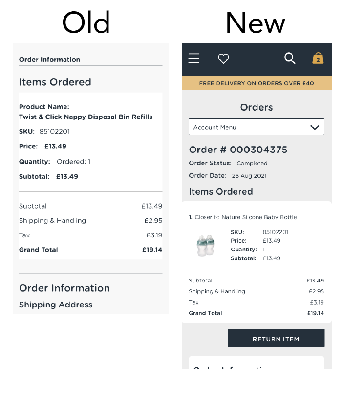
These four screens represent only part of the whole prototype and they are showing an account holders view. I’ve provided the old and new representations so you can see the changes I’ve made to the screens and user experience. The four screens showing are; Orders summary, single order overview, returning an item and returning confirmation.
The main change you will notice in these screens is making it more visual so the user can clearly see what they are returning throughout the whole process. There is also a lot more supporting information between sections so the user knows exactly what they need to do at each step.


User testing overview
The user testing was completed using software called UserZoom and was an unmoderated test that was sent out to 8 participants to be completed on their mobiles. The testing was split into four parts with an additional section at the beginning for screening questions. The screening questions along with the specified demographic is what ensures the correct participants are completing the test.
These 4 sections of the test are the testing introduction then the contextual research followed by the test tasks then finished with the final questions about the experience as a whole. Below are the tasks and scenarios I wrote to test the prototype;
As a guest navigate to the returns page, find your order (baby bottle) and return the item.
Scenario: You ordered a baby bottle a week ago, unfortunately, the mouthpiece is broken (faulty) and you would like to return it. You didn't create a customer account at the time of purchase so you are returning the item as a guest. After completing the return you are sent a confirmation email (as this is a prototype you won't receive this email).
As a returning customer, I can access my account and return an item (Closer to Nature Silicone Baby Bottle) from my orders page.
Scenario: Imagine that you are already signed in to the site and that you access your account through the menu button as opposed to the return link. Start a return from the orders page and select your item to return. Browse the options of where to return your order but consider this is a prototype and the locations are not accurate. Once you are satisfied with your order submit it and complete it there.
As a returning customer, I can access the QR code from 'My Returns' page when I'm at a drop off location.
Scenario: You now need to drop off your parcel and need your QR code to do so. For this scenario, you will use the 'My Returns' page as opposed to using the confirmation email sent to your email (not shown in the prototype). Navigate to the returns page and find the details and QR code from you return you created.

Results from Task 3
UX Roadmap
As part of my contract at GENE, I put together a presentation for pitching starting a UX Roadmap with their clients. This presentation was then going to be shared with all the in-house solution specialists to present to their respective clients. The positives for doing this would serve all stakeholders involved for future products and improvements. The key stakeholder involved in the UX roadmap is the users followed by the agency and the agency’s clients.
By creating a UX Roadmap it allowed the designer the necessary time to do the appropriate user research for projects and testing. For the agency, it created more pipeline for forecasting and visible work that could be charged for. Finally, for the client, it would make sure that no part of their product or site would go neglected and that their customers are always put first. I broke the UX Roadmap into four steps/ sections:
UX analysis
Heuristic Evaluation
User testing
Performance review
2. Client workshop
Gather Goals
Understand gaps/pain points
UX Analysis findings
3. Prioritise & Estimate
Create high-level user stories/ epics and against them put estimates of UX effort, Dev effort, and overall priority.
These estimates should be agreed upon by the whole team and so the project managers can accurately use the estimates to plan future sprints.
Finally, the estimates should be measured in low, medium, high and very high and not time as you don’t want to get bogged down in the detail at this stage.
4. Plan (Now, Next and later)
Using something like a Trello board or a Gantt chart plan out what work will be done this sprint and the next sprint, Now is usually within the month. Next is usually within the coming months 1-3 months and anything after that is Later.
The UX roadmap should be revisited continuously to be updated and client workshops should be held every 3 months to realign with all stakeholders.